Overview
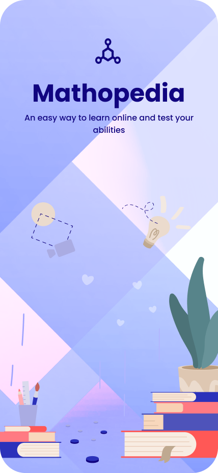
Mathopedia simplifies math through gamification, interactive modules, and tailored lesson plans. The goal was to help young learners build confidence in math — and start to enjoy problem-solving along the way.
The problem
Plenty of educational apps exist, but most fail to hold a kid's attention. Math, in particular, is perceived as boring or intimidating. From research we kept hearing the same three pain points:
- Lack of personalization — generic lessons that ignore skill and pace.
- Limited engagement — no interactivity or rewards to keep kids coming back.
- Overwhelming interfaces — adult UI patterns crammed into kids' products.
Objectives
- Design an intuitive, age-appropriate interface for 8–14 year olds
- Use gamification to keep learners motivated and invested
- Build a personalized system that adapts to each student's pace
- Keep the visual language clean, colorful, and cognitively light
Research & insights
I interviewed 10 students, 8 parents, and 5 teachers to understand how math gets taught and where it breaks down — at home, in class, and inside competing apps like Khan Academy and Prodigy.
Key findings
- Children learn best when lessons are interactive and playful.
- Rewards and feedback (badges, trophies, streaks) materially boost motivation.
- Simple, colorful UI helps retain attention and reduces cognitive load.
Design process
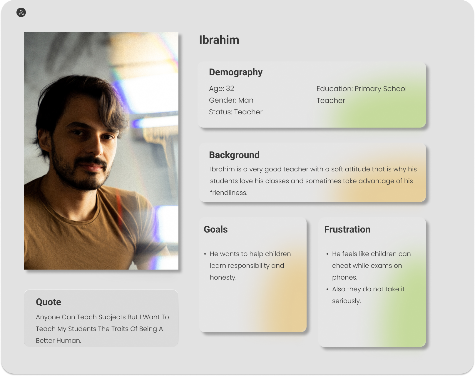
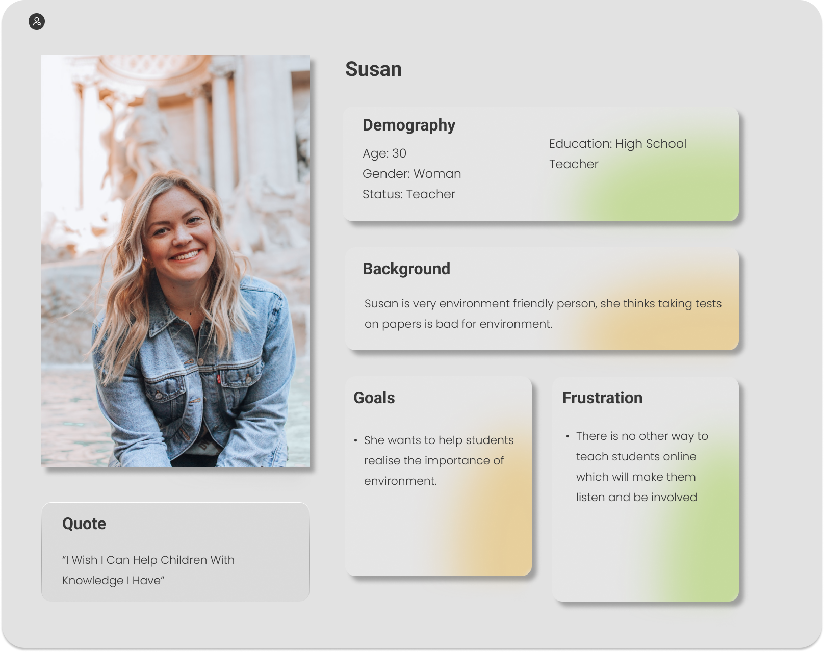
1. Empathy mapping & personas
I built two teacher personas to anchor design decisions — what they wanted for students, and what frustrated them about existing tools.
2. Ideation
- Brainstormed daily challenges, quizzes, leaderboards, and progress dashboards
- Prioritized features against user feedback and engineering feasibility
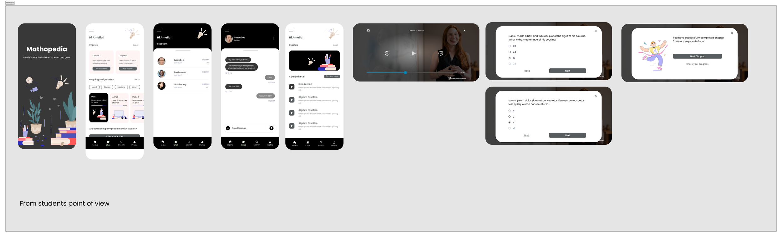
3. Wireframing & prototyping
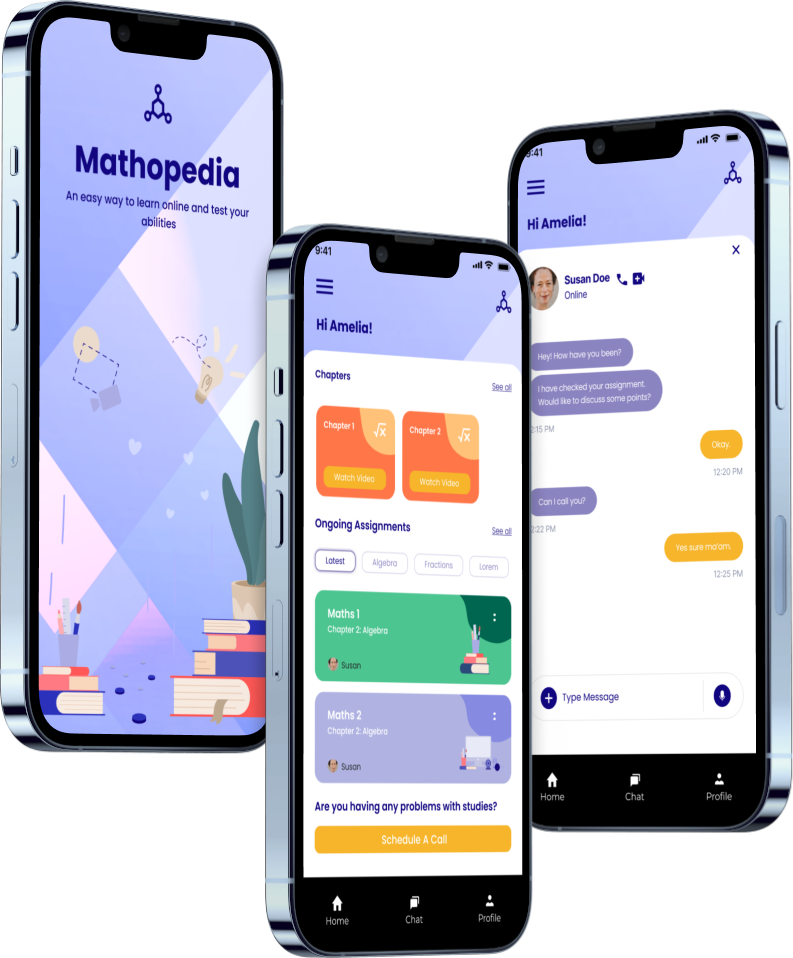
Low-fidelity wireframes mapped the structure and flow. High-fidelity prototypes in Figma layered in bright color, playful illustration, and simple navigation.
4. Usability testing
Prototypes were tested with 15 students. Iterations included larger font sizes and audio cues for the youngest users — small things that made the app usable end-to-end.
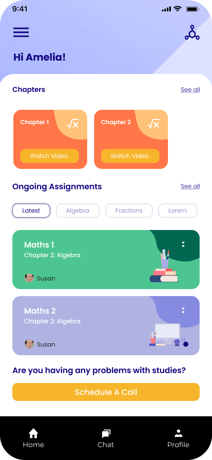
Key features
- Personalized learning paths — AI-driven adjustments and a progress dashboard for each student.
- Gamification — quizzes, badges, streaks, and leaderboards for friendly competition.
- Interactive modules — drag-and-drop activities and real-time feedback.
- Parent & teacher dashboards — visibility into where students need help.
Final design
- Color: bright, inviting palette to evoke positivity and focus.
- Typography: large, rounded fonts for readability.
- Illustration: custom characters and playful icons.
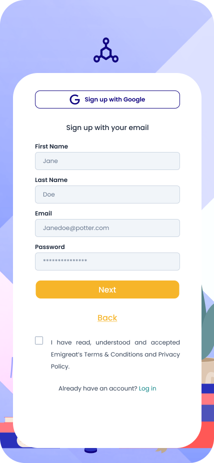
- Navigation: simplified, with direct access to lessons, quizzes, and rewards.
Conclusion
Mathopedia shows what happens when you design for the actual humans using the product — even when they're 10 years old. Personalization, gamification, and a kid-first interface turn math from a chore into something they want to come back to.