The problem
Marketing stakeholders couldn't interpret campaign data quickly. Too many KPIs competed for attention, the hierarchy was flat, and the UI hadn't kept up with the brand. Reviewing a campaign meant scrolling, hunting, and second-guessing — and people stopped trusting the numbers.
My role
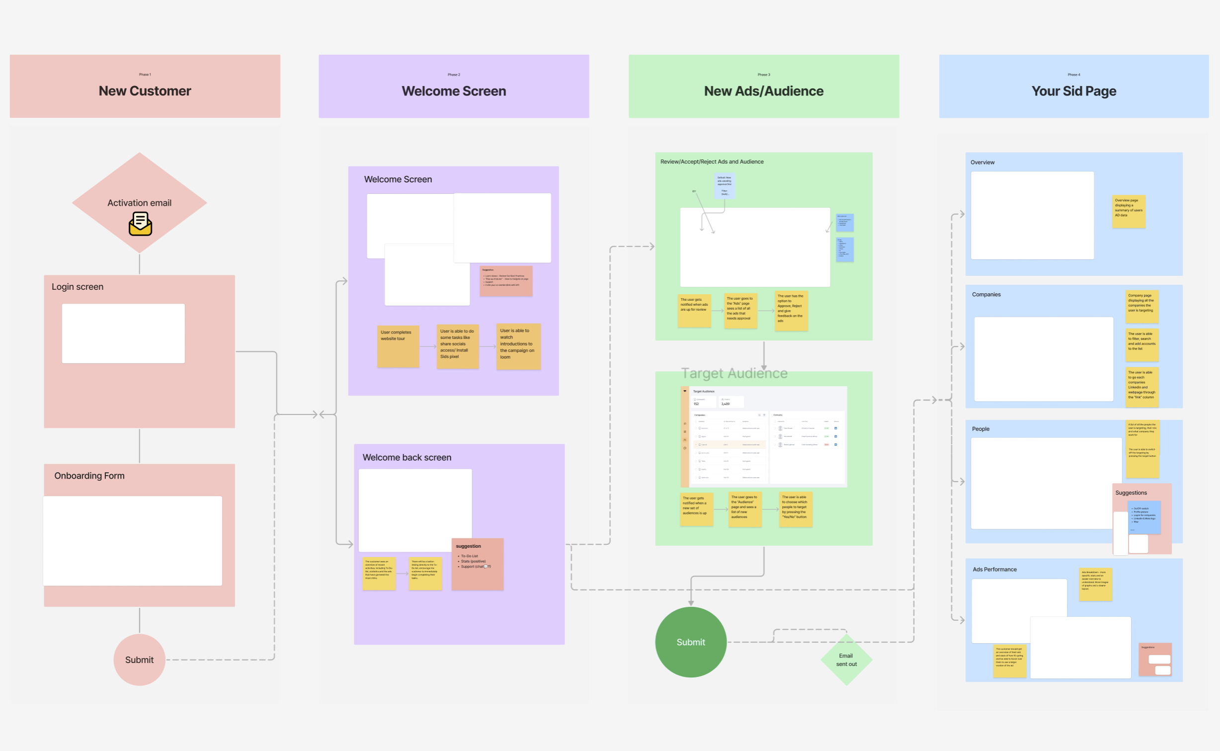
- Led UX research — surveys and a heuristic audit of the existing product
- Designed the information architecture for the new dashboard
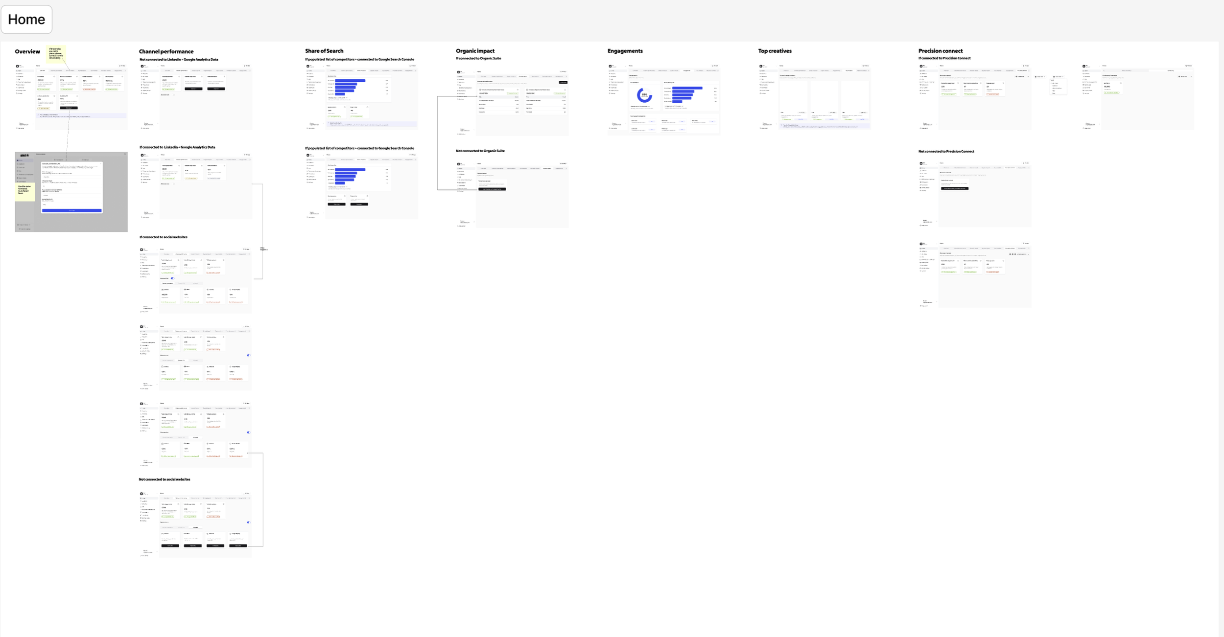
- Created wireframes, UI layouts, and prototype flows in Figma
- Delivered annotated Figma files for engineering handoff
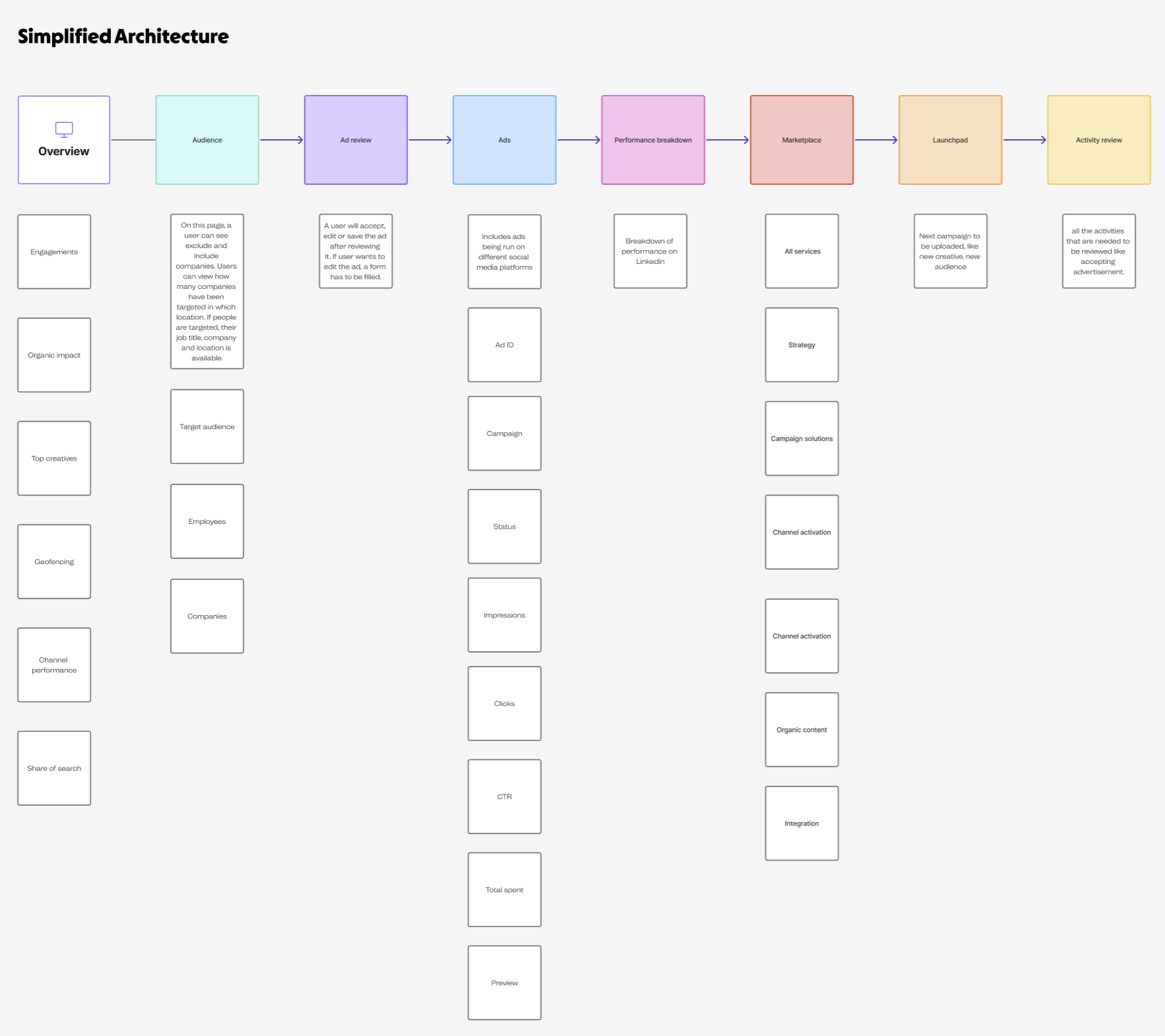
Goals
- Improve clarity and scannability of campaign data
- Prioritize the metrics that drive day-to-day decisions
- Reduce friction in core tasks — review and comparison
- Bring the visual language in line with the brand evolution
Research insights
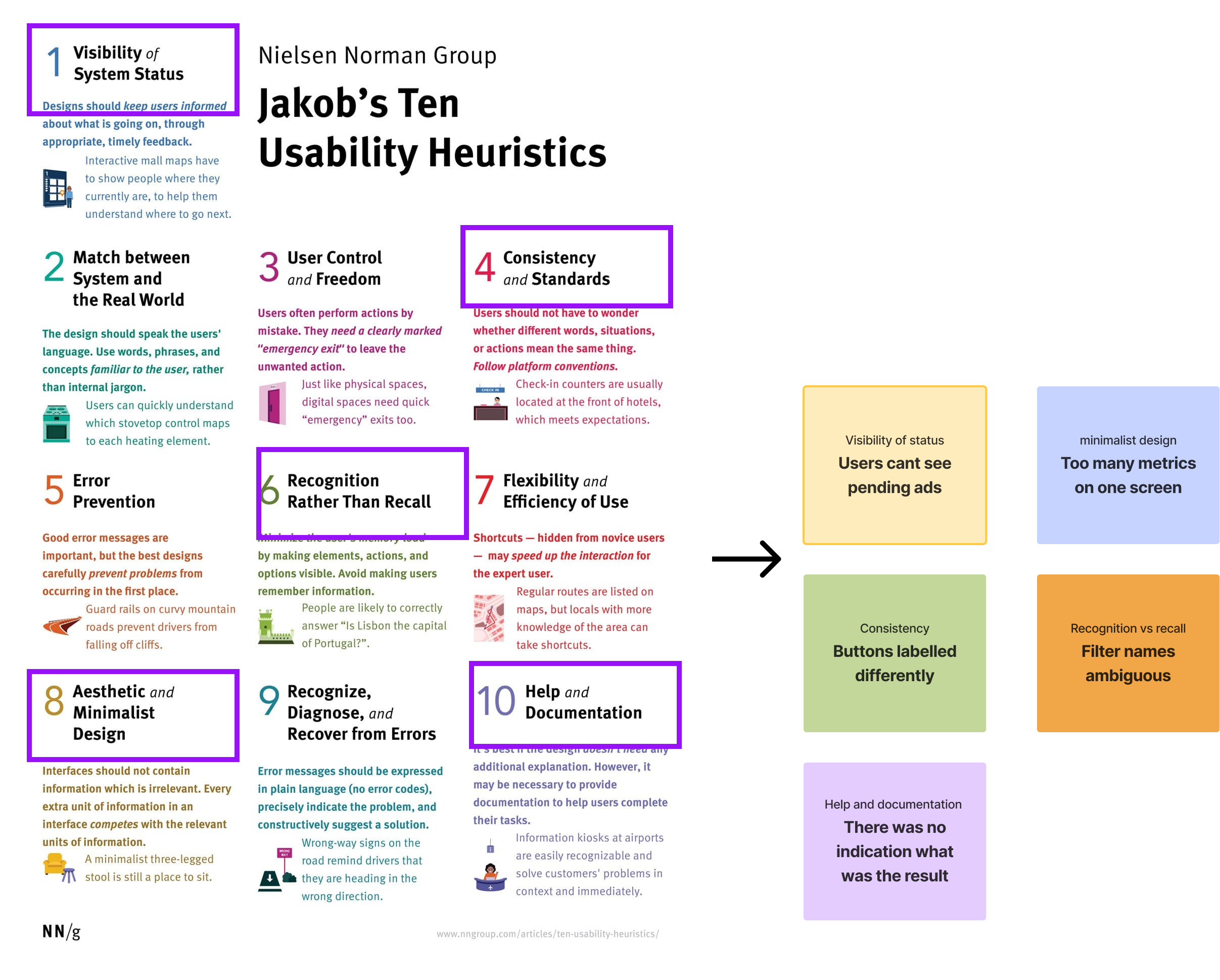
- Heuristic evaluation: major violations in visibility, consistency, and flexibility.
- Surveys: 70% of users felt “overwhelmed” by too many metrics on screen.
- User interviews: most users only checked 3–4 KPIs regularly.
Key insight: users wanted fewer, clearer metrics — and a view tailored to how they actually worked, not a wall of every available number.
Design decisions
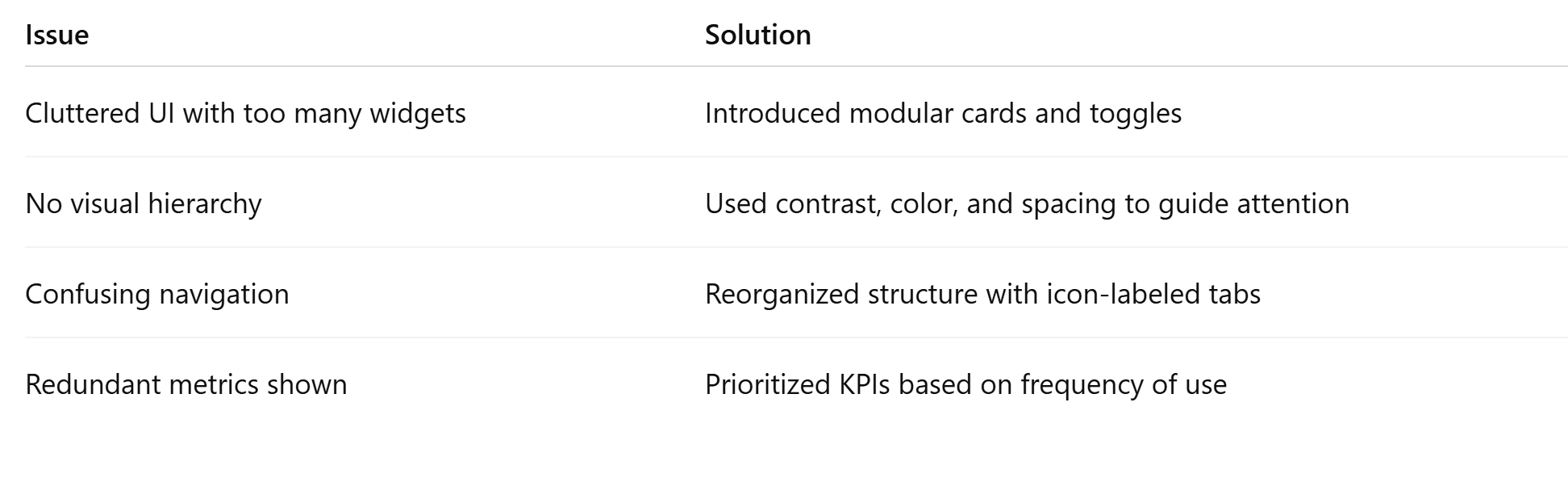
What the old UI got wrong
- Metrics lacked grouping or hierarchy
- Inconsistent data visualization across widgets
- No way to customize the view
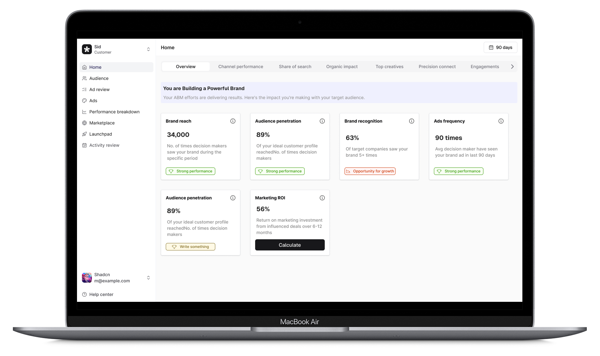
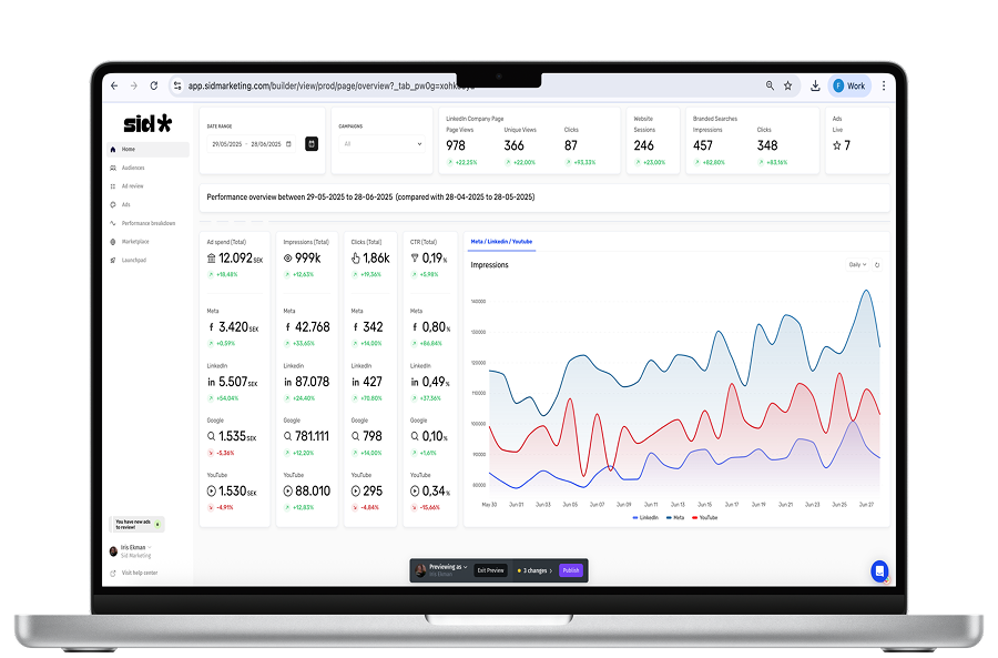
What the new UI does
- Tab-based navigation segments core workflows
- Visual status indicators make ad-approval state obvious at a glance
- Simplified KPI blocks use bold headlines and intentional spacing
- Toast components with a 6px radius keep micro-interactions calm and consistent
Outcome
- 50% faster task completion in usability testing
- 3 out of 5 users rated the new flow “very intuitive”
- Stakeholders called out improved readability and brand alignment
The groundwork
A look at the IA work, wireframes, and design explorations behind the final UI.