UX/UI case study · Independent project
Kassa.
Making everyday sales tracking effortless.
Open prototype- Role
- UX/UI Designer
- Project
- Independent case study
- Platform
- Desktop
- Tools
- Figma · Lovable
- Research
- Owner & POS interviews
The challenge
Small food-business owners handle dozens of transactions every day. They need to record the amount, payment type, purchase, and daily total while continuing to serve customers.
The software used by my research participants could capture this information, but the process felt more complicated than it needed to be. Every extra field and click became friction.
How might we make recording a sale quick and effortless, while still giving owners the information they need?
Research
I interviewed my father, who runs a pizza and ice-cream business in Pakistan, and people using similar sales software. I focused on how they record sales during a busy day—not just which features they wanted.
The questions users need answered
- How much did I make today?
- How much was cash or card?
- What did I sell the most?
- Am I doing better than yesterday?
Key insight
The problem wasn't a lack of information. It was the effort required to enter and understand it.
Design principles
Record first, understand later
Make sales entry extremely fast.
Ask only what is necessary
Avoid a long form for every transaction.
Speak the user's language
Use familiar, direct wording for every action.
Turn data into answers
Explain what is happening instead of showing a spreadsheet.
The core experience
I reduced the primary workflow to four clear steps. Product information remains optional, so a basic transaction never requires unnecessary fields.
Add sale
Enter amount
Choose payment
Save
05 · Dashboard
Answers, not analytics.
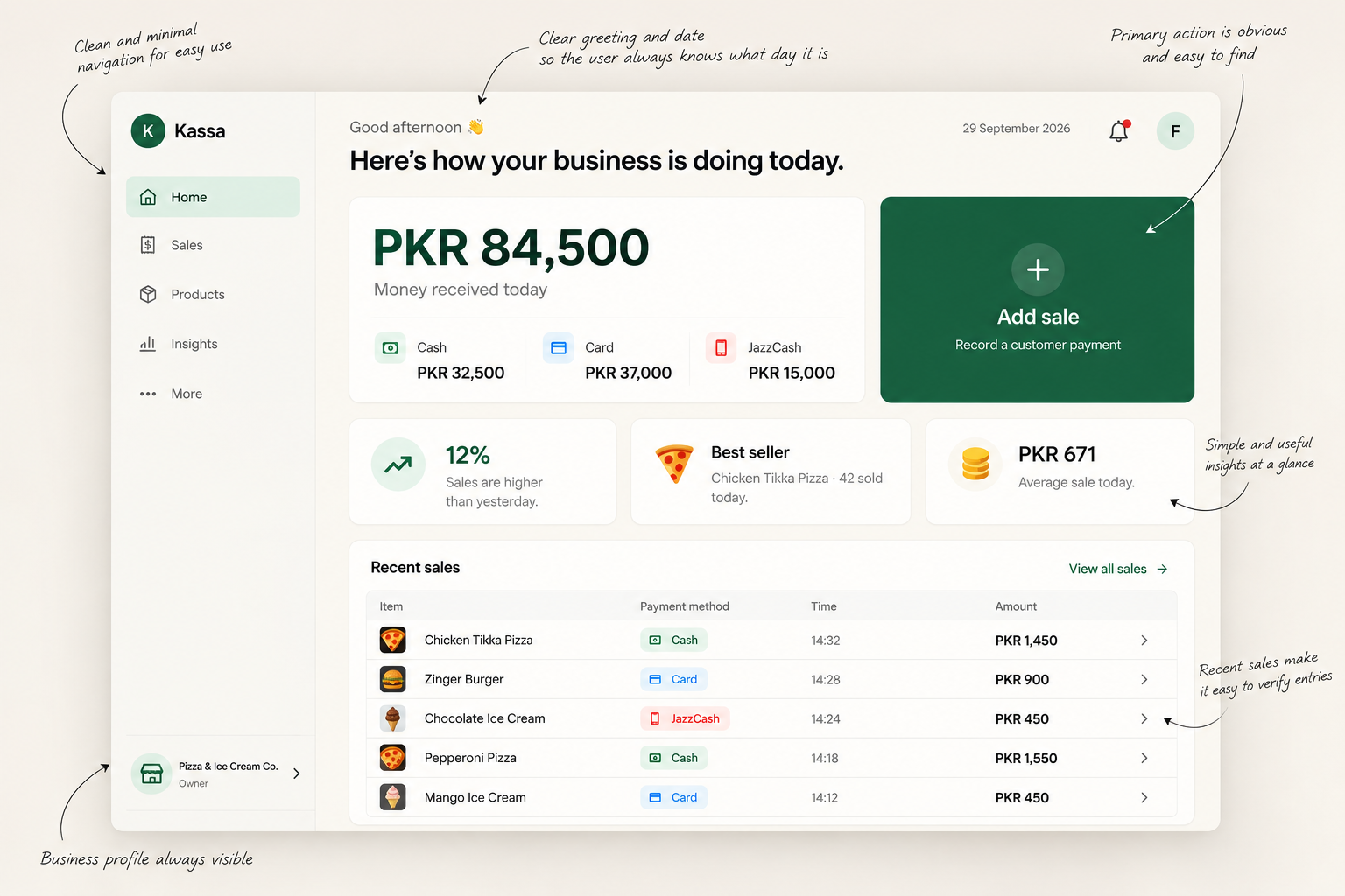
The dashboard balances recording information with understanding it. Owners see the day's financial picture without opening a report.
Money received today
PKR 84,500
Cash · Card · JazzCash
Compared with yesterday
+12%
Sales are higher
Best seller
Chicken Tikka
42 sold today
Average sale
PKR 671
Typical transaction value
Payment breakdown
How customers paid
Designed for confidence
Low digital literacy
Large actions, familiar icons, short labels, and consistent patterns make the interface understandable without training.
Lightweight insights
Performance, payment methods, best sellers, and average sales are translated into plain-language answers.
Cash reconciliation
A difference between recorded and actual cash is explained clearly, without difficult accounting terminology.
What I would validate next
- Can users record a sale without instructions?
- How quickly can they complete it?
- Are payment options understood immediately?
- Do the insights make sense at a glance?
- Does the reduced interface feel easier?
The most important measure
How little effort does it take to record a sale correctly?
Outcome
Kassa began as a sales tracker. Research revealed a bigger opportunity: reduce cognitive load around the most frequent task.
Good UX isn't always about adding more intelligence or features. Sometimes it's about removing everything that gets in the user's way.Explore the Kassa prototype